
How can a dental website create clearer booking enquiries?
Dental website conversion tips are most useful for practice owners who receive website visits but need more suitable appointment requests. The direct answer is to make every important page explain the service, location, next contact step and likely response process, then review whether those enquiries become booked and attended visits without exposing private health details.
A form completion is not a completed appointment. Visitors may be outside the practice area, seeking an unavailable service, uncertain about payment arrangements or expecting immediate availability that staff must first confirm. A stronger website reduces those mismatches before contact while keeping clinical decisions for the appropriate consultation.
1. Decide what appointment each page should help request
Start with pages closest to an appointment decision: the contact page, new-patient page, urgent appointment page and major service pages. Assign each page one main job. A person looking for a routine visit needs a different route from someone asking about a consultation, so a broad page that presents every service equally can create hesitation.
Write a short page brief before changing design or copy. Include the service the practice can discuss, the likely visitor question, the confirmed practice location, the approved contact method, what staff must clarify after contact and who approves factual wording. This prevents useful-looking pages from attracting requests the team cannot support.
If the practice uses Google Ads, direct each service-focused message to the matching page rather than a general home page. Search advertising can help separate urgent, general and treatment-specific demand, but the page must still fulfil the practical expectation created by the ad.
2. Build the booking page around practical visitor questions
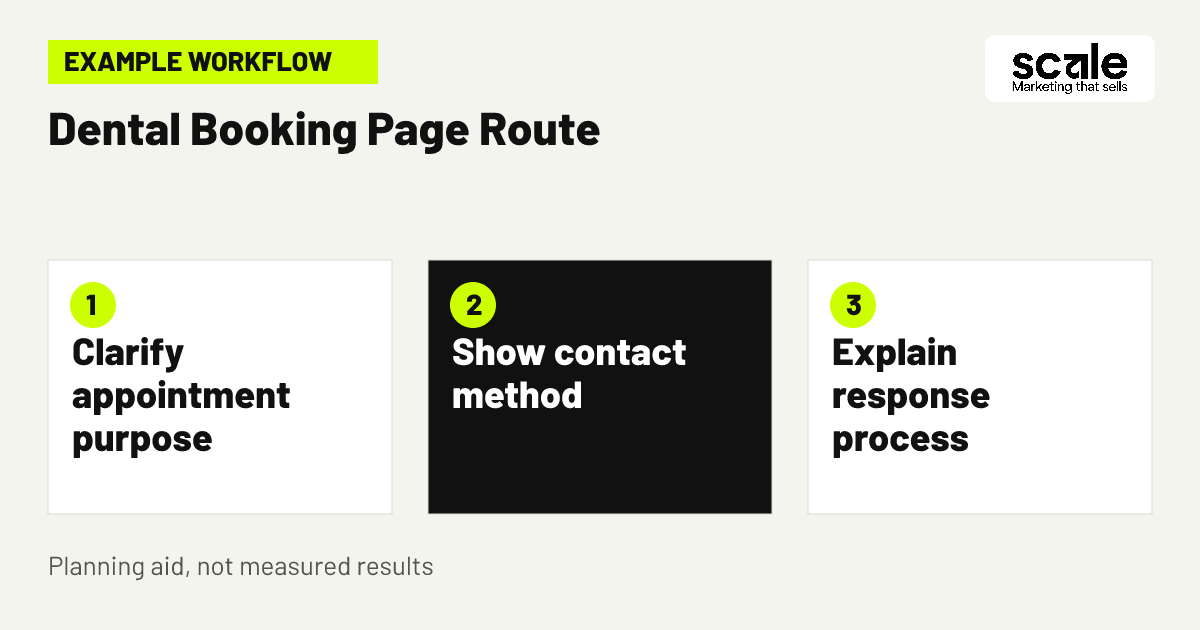
A dental appointment booking page should make four points easy to find: what appointment or conversation the person is requesting, where the practice is, how to contact the team and whether availability is confirmed after contact. Put those answers near the top in plain language, not after long descriptions of general dentistry.
Use a primary action that describes the real next step, such as Request an appointment or Ask about appointment availability. Add a short explanation beside it when needed: the team will contact you to discuss availability. This reduces the risk that visitors interpret a form submission as a confirmed booking.
Check the route on a phone before publishing. Test every call button, form field, confirmation message and navigation link. Visitors should not need to return to a menu, open several pages or read unrelated treatment information before they can make an appropriate request.
A useful page-order check
Read the page as a first-time visitor. Within the opening screen, can you tell which appointment the page concerns, whether the practice location is practical and what happens after you make contact? If the answer is unclear, move those decision details upward before adding more promotional copy.
Keep secondary links subordinate
Links to team biographies, payment information or related services can help a visitor decide, but they should not compete with the main appointment route. Keep the primary action visually clear and use supporting links only when they resolve a likely booking question.
3. Map a new-patient request from page to response
Example: A person searches for a nearby practice because they want a routine dental appointment. They arrive on a page that states the practice area, explains that the team can discuss a first appointment and offers a visible enquiry route. The page does not ask them to describe symptoms or treatment history in order to get a reply.
The form requests a name, preferred contact method and broad appointment interest. Its confirmation message says the practice will contact the person to discuss availability. Reception records a restricted status such as enquiry received, appointment requested, booked, attended, outside area or unavailable service, without placing detailed patient information in marketing reports.
Review the journey with the team. If people regularly request a service the practice does not provide, clarify service scope on the page. If visitors expect an instant appointment confirmation, improve the button label and confirmation message. If suitable enquiries do not progress, inspect the response process before redesigning the website.
4. Reduce dental contact forms to booking essentials
Dental contact forms should ask only for details needed to respond to a marketing enquiry. In many cases, a name, preferred contact method, broad appointment type and suitable time to contact are enough. Every additional field should have a practical purpose in the initial response process.
Avoid open-ended prompts that encourage people to share condition details, symptoms or treatment history when that information is not necessary to request contact. A simple choice such as new-patient appointment, existing-patient query or question about a listed service may be more useful if it matches the practice workflow.
Patient privacy tracking needs a separate review before form changes go live. Confirm who receives submissions, who can access them, where they are stored and whether connected analytics or advertising tools could receive sensitive content. Do not assume a form is private simply because it sits on the practice website.
5. Make service pages answer pre-booking questions
A service page should help a prospective patient decide whether contacting the practice is sensible. Explain the service the practice offers, the broad purpose of an initial conversation, where appointments take place, how to ask about availability and which practical questions the team can clarify. Keep treatment suitability and clinical recommendations for the consultation.
Useful local pages can support SEO when they add real appointment information, such as a distinct clinic location, access details or a different service arrangement. Do not create near-identical pages for every nearby suburb when the same practice, service and contact route apply. Repetition can confuse visitors as well as dilute page purpose.
Use recurring reception questions as a content checklist. If people repeatedly ask whether the practice provides a named service, where to attend or how a first visit works, publish the approved answer on the page closest to that decision. If the answer depends on individual circumstances, explain how to ask the team instead.
6. Use calls to action that match the actual process
A call to action should identify the conversation a visitor is starting, not promise an outcome. Request an appointment, Ask about availability and Contact the practice about a first visit are clearer than vague labels such as Submit. Choose wording that reception can genuinely fulfil after the visitor gets in touch.
Keep one main action per page. Secondary choices can be useful when they serve a different practical preference, such as a phone route for an urgent request and a form for a non-urgent appointment enquiry. Too many equally prominent actions can make a visitor pause rather than act.
Test call-to-action wording against actual questions received. If form users believe they have secured an appointment immediately, clarify the response process. If visitors choose a general information option when they really want to schedule, make the booking route more visible instead of introducing more form fields.
7. Show location and payment context before contact
Suitable enquiries often depend on practical details rather than persuasive language. Show the confirmed practice address, service area, contact method and relevant appointment information consistently across service pages, contact pages and paid-search destinations. Visitors should be able to judge whether the location is workable before they enquire.
Payment information should set expectations without implying coverage, eligibility or treatment approval. Publish only wording the practice has approved, and explain what the team can discuss after contact. If payment questions are a common reason people do not proceed, make the approved explanation easier to find rather than hiding it in a large FAQ section.
Use broad reception feedback to diagnose mismatches. Frequent enquiries from impractical distances may point to weak location wording or overly broad advertising reach. Repeated payment confusion may mean relevant information is buried. Correct the page or campaign message associated with the pattern before expanding promotion.
8. Treat consultation call follow-up as a conversion step
Consultation call follow-up matters because a suitable website enquiry can still be lost after submission. Agree who responds, which contact method they use, what broad appointment information they confirm and how unanswered requests are reviewed. This is a marketing conversion process, not a request for clinical detail through a website form.
Create a short, approved response guide that mirrors the page promise. It can cover the appointment type requested, whether the location is practical, how availability is confirmed and the visitor's preferred way to continue the conversation. Consistency helps prevent a website from creating expectations staff cannot meet.
Review follow-up through restricted status categories rather than detailed marketing notes. If suitable requests do not become bookings, first examine response timing, unsuccessful contact attempts and availability communication. A website change cannot resolve a gap caused by an unclear or inconsistent response process.
Keep feedback useful and limited
Reception feedback should identify recurring marketing friction, such as outside-area contacts, requests for unavailable services or uncertainty about how to book. It should not transfer private health details into campaign reports or analytics dashboards.
Use stable booking labels
Use the same small set of internal labels over time, such as received, requested, booked, attended and unsuitable. Stable definitions make it easier to see whether a revised page or campaign message is changing enquiry fit rather than merely changing how staff describe an outcome.
9. Remove distractions from high-intent landing pages
A visitor arriving from a service search should not have to sort through every treatment the practice offers. Keep the opening focused on the requested appointment or service, then use supporting links only where they help a person decide whether to contact the team. Unrelated promotions and dense navigation can bury the next step.
Trust information should resolve uncertainty, not overwhelm the page. A concise practice introduction, approved team information, clear location and a plain explanation of the appointment process can be more useful than broad claims. Do not imply outcomes, qualifications or patient experiences that the practice has not verified for publication.
Run a guided walkthrough with someone unfamiliar with the page. Ask them to find the appointment route and explain what they think happens next. If they cannot distinguish action from background information, or they drift into unrelated navigation, simplify the page before adding new content.
10. Track approved actions, not sensitive form detail
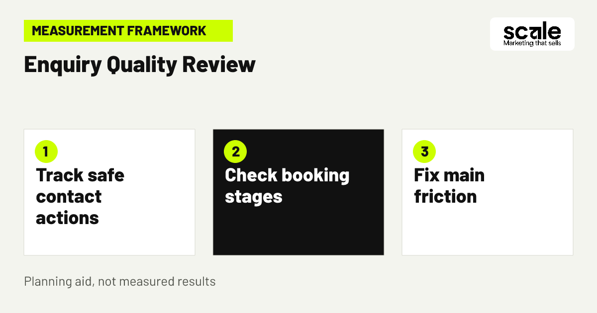
Measure privacy-approved actions such as a click to a contact route or arrival at a confirmation page, rather than passing form entries, appointment notes or revealing page context into analytics or advertising systems. Decide what is appropriate to measure with the people responsible for privacy and legal obligations before tags are implemented.
Analytics events can record website interactions such as page loads and link clicks. Configure a separate event for each approved action, then test that it fires only at the intended point and carries no unnecessary parameters. Use available debugging and real-time reporting tools to verify the implementation before interpreting the data.
Connect website activity to later booking outcomes through a restricted internal process. Compare broad stages by entry page or traffic source without adding names, health details or free-text submissions to marketing reports. This gives the practice a more useful view than raw form volume alone.
Marketing mistakes that weaken dental booking enquiries
A common mistake is treating every form completion as equally valuable. Diagnose this by comparing contact actions with broad outcomes such as booked, attended, outside area or unavailable service. The correction may be clearer service wording, a better location message or improved follow-up, not simply more website traffic.
Another mistake is requesting too much too early. Long forms and free-text health prompts can discourage visitors while creating unnecessary privacy exposure. If people abandon the form or staff receive unusable messages, remove fields that do not change the first response and clarify any remaining instructions.
Practices also lose prospective patients when ads, pages and staff messages conflict. Audit the whole route whenever services, locations, payment wording or appointment processes change. If the page implies immediate booking but staff must confirm availability, correct that mismatch before investing in further promotion.
Which measures connect enquiries with attended appointments?
Use a simple funnel that reflects the real journey: relevant page view, approved contact action, enquiry received, appointment requested, booked and attended. Website reporting is most useful at the early stages, while restricted internal records confirm later progress. Keep definitions consistent so reporting changes have meaning.
Read signals in sequence. Relevant page views with few contact actions can mean the action is hidden, the page lacks decision details or the mobile route is difficult. Many enquiries with few bookings can indicate confusion about service scope, distance, payment or availability. Bookings with weak attendance require a separate review of reminders and follow-up.
Prioritize the bottleneck supported by evidence. Repair a broken mobile form before rewriting service copy. Clarify location details before expanding geographic promotion. Record one meaningful change and the reason for it, then ask reception whether the same confusion continues. Events can support this review when their implementation has been tested and privacy-checked.
Conclusion: fix the clearest booking obstacle first
The strongest dental website conversion tips make the next appointment conversation understandable, remove unnecessary form friction and connect website behaviour with privacy-conscious booking feedback. More traffic is not the first answer when visitors cannot identify the right service, location or response process.
Choose one high-intent page to review with a practice decision-maker and reception lead. Confirm its service wording, location details, contact route, confirmation message, form fields and approved measurement action. Fix the single biggest mismatch they identify, then review enquiry quality before making the next change.
Related resources
Dentist Marketing · Google Ads Management · SEO Services · Digital Marketing · 11 Dental SEO Ideas to Attract Implant Consultations · 12 Google Ads Tips for Dental Emergencies That Drive Bookings