
Turn urgent visits into appropriate assessment requests
Water damage website conversion tips are most useful when they remove uncertainty without making promises your team cannot keep. This guide is for local restoration businesses that want more suitable assessment enquiries from their existing website, search traffic or local advertising. The direct answer is to make the requested service, coverage area, contact route and review process obvious at the moment someone needs help.
A conversion-focused site is not simply one with a larger button. A property owner may be deciding whether the issue needs an assessment, whether you cover their location, and whether their problem relates to water extraction, drying or mold remediation. Your page should answer those questions quickly, then collect only the information needed to route the request. If no one can review new enquiries reliably, improving promotion first can create avoidable frustration.
1. Decide which requests each page is meant to earn
Start by mapping each high-intent page to one real request type. A page about visible water damage can invite an assessment enquiry; a drying page can explain the drying service and the same review route; a mold remediation page should not pretend that every water-related visitor needs identical help. This decision prevents generic wording from attracting people your team does not cover or cannot assess.
List the service areas you genuinely serve, the damage types you want to consider, and the team member or queue that receives each request. Then decide what the page can honestly say before review. It is reasonable to explain that the team will review location, damage details and availability. It is not suitable to state an arrival time, promise acceptance, or suggest insurance coverage has been confirmed. A useful conversion is a request your business can handle responsibly, not merely a submitted form.
This approach also gives Google Ads Management and SEO Services a more coherent destination: search ads and organic pages can lead to content matching the searcher’s immediate need, rather than a broad homepage. Check that ad wording, page heading and call to action describe the same service. Google’s guidance also stresses making ads and websites mobile-friendly, an important check for urgent searches made away from a desk.
2. Build an assessment landing page around decisions visitors need to make
An assessment landing page should put the practical next step near the top: request an assessment, call your team, or submit details for review. Immediately explain what an assessment request is for in plain language. State the service area, the types of issue the page addresses, and that the team reviews whether it can respond. Add verified business details and a clear contact route, rather than decorative claims that do not help someone decide.
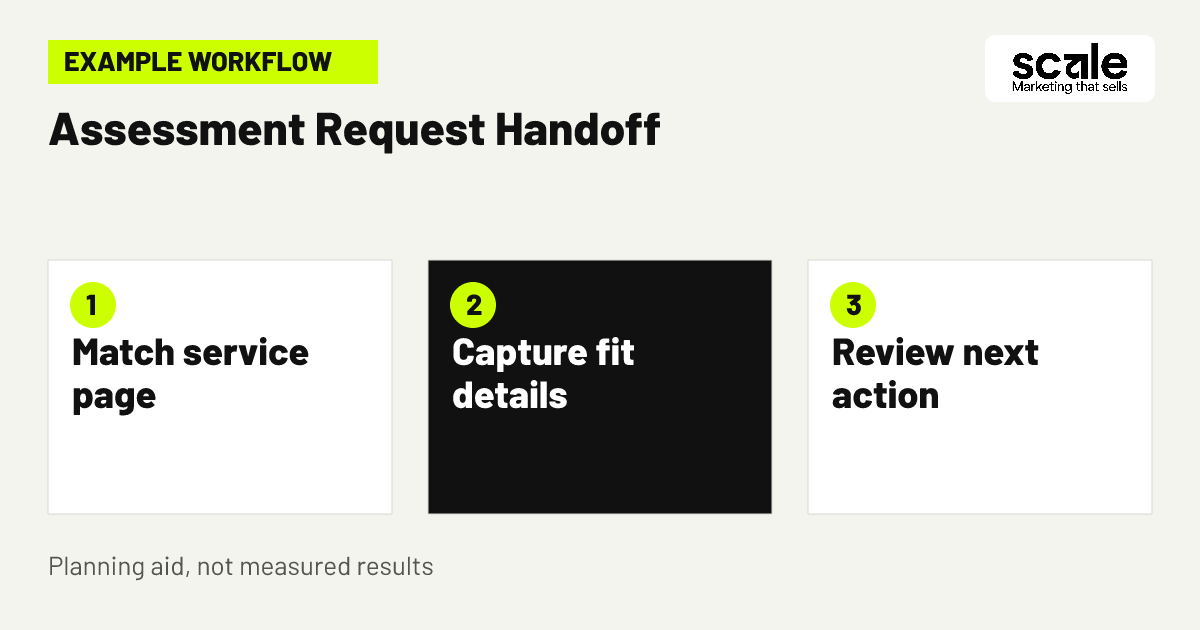
Below that first decision, explain what the visitor can prepare: property location, a short description of the damage, when it was noticed, and preferred contact details. Describe what happens after submission, such as receipt confirmation and team review. Keep this process distinct from claims about a confirmed appointment, arrival or outcome. On mobile, test that the main action remains easy to find, text is legible and the form does not require excessive scrolling.
Before publishing, run a real-device check: open the page from a search ad preview or a normal mobile browser, tap every phone and form action, submit a test request where safe, and confirm the receiving team sees it. Fix broken routing before spending more on traffic. The aim is not a longer page; it is a page that resolves the reasons a suitable visitor might hesitate.
What information should a water damage assessment landing page include?
Include a specific service heading, genuine coverage areas, a concise explanation of what the assessment request concerns, visible contact choices and an honest account of the review process. Include only verified details about your business. If service availability changes by location or damage type, say that requests are reviewed rather than hiding that condition until after submission.
A practical page brief
Sample brief: create a mobile-first page for property owners reporting water damage in named service areas. Lead with the assessment request, explain the issue types considered, show the phone and form route, ask for location and damage summary, and confirm that a team member reviews availability. Remove any statement that could be read as a promise of insurance approval or a fixed arrival time.
3. Match the call to action to the visitor’s situation
Use calls to action that describe an action, not vague enthusiasm. “Request an assessment review” is clearer than “Get help now” when your team must check the details first. Keep the same phrase in the page heading, beside the form and in the confirmation screen so the visitor knows what they are asking for. A prominent phone option may suit someone who prefers to speak, while the form provides an alternative when a call is not practical.
Example: a homeowner reaches a drying-focused page after noticing wet flooring. The page says the team reviews requests for properties in its stated area and asks whether the problem concerns water damage, drying or another listed service. The visitor selects water damage and drying, enters the property location and a short description, then sees confirmation that the enquiry was received for review. The team can now decide whether to contact the person, route the request or explain that it is outside coverage. No outcome is implied before that review.
Evaluate this tactic by checking whether people use the intended action and whether staff receive enough context to route requests. If callers repeatedly ask what an assessment involves, the page explanation is too thin. If form submissions routinely concern a service not offered, strengthen the service labels and add a clear alternative message before the form.
Choose one primary action per page
A page can offer a phone number and a form, but it should have one primary next step. On an assessment page, the form may be primary and the call option supportive. On a page aimed at callers needing immediate clarification, the phone action may lead. Competing buttons for unrelated services split attention and make reporting harder.
Keep confirmations consistent
The post-submit message, automated acknowledgement and staff script should all use the same review-based language. If the page says “request review” but the confirmation says “your appointment is booked,” visitors receive conflicting information and staff must correct expectations later.
4. Make the restoration contact form easy to complete and route
A restoration contact form should ask for enough information to identify fit without turning an urgent enquiry into a questionnaire. Start with name, preferred contact method, property location, service needed and a short description. Add a consent-aware way to contact the person about their request. Avoid asking for sensitive or unnecessary detail just because a field is available; information you do not need is harder to manage and does not improve qualification.
Use choices where they reduce ambiguity, such as water damage, drying or mold remediation, but retain a short free-text field for context. Make location a useful field rather than a generic address demand if the first question is whether the property is in coverage. Clearly mark required fields, show field-level errors and preserve entries if a visitor misses a requirement. These small usability checks prevent abandonment caused by form mechanics rather than lack of demand.
Send each request to a monitored destination with the service type and location visible in the notification. Test duplicate prevention and fallback handling when a notification cannot be delivered. If staff receive incomplete requests, inspect which field causes confusion before adding more questions. Often a clearer label or help text works better than a longer form.
How can a restoration contact form help visitors take the right next step?
It can set expectations while collecting the details that determine the next responsible action. Explain that submission requests review, specify what details help the team assess fit, and give a phone route for people who prefer it. The form helps visitors by making the process understandable, not by implying that an assessment has already been accepted.
5. Put service-area clarity before the submit button
Location is often the first fit question for a restoration enquiry. Name genuine service areas on the relevant page and make any boundary condition understandable. Do not create copied local pages that imply offices or response coverage you do not have. A visitor outside your normal area should be able to discover that before investing time in a detailed request.
Where coverage depends on the property location, use wording such as “Tell us the property location so we can review coverage.” That is clear without overcommitting. If advertising is active, align geographic targeting, ad copy and landing-page wording with the same areas, then revisit them when operational capacity changes. Search campaigns are more useful when they lead to a page that answers the location question honestly.
Review staff notes for patterns. Requests from outside coverage may indicate unclear geography, but they may also reveal that a named town or nearby area is being interpreted broadly. Improve the explanation before assuming the form itself is at fault. This protects the visitor experience and helps preserve staff time for requests that may fit.
6. Explain services without promising a restoration outcome
Visitors need to understand the difference between assessment, drying and mold remediation, but they do not need technical detail that delays contact. Give each service a short explanation of the concern it addresses and the reason the team may need to review the property details. Use the same terms in navigation, ads and form options so visitors do not have to translate marketing language into the help they need.
Avoid statements that turn a marketing page into a promise about coverage, remediation results or timing. Replace them with process information: what the visitor can submit, what the team checks and how the team will communicate the next step. This is more credible than blanket assurances and reduces the chance that the contact process begins with a correction.
If pages attract broad informational visitors but few appropriate enquiries, add a concise service-fit section above the call to action. If visitors ask whether a particular type of issue is included, use that repeated question to improve the relevant page, provided the answer is verified and consistent with your actual offer.
7. Use emergency service messaging that stays honest
Emergency service messaging should acknowledge urgency while preserving operational truth. Put the contact route, service area and review condition where a worried visitor will see them. Avoid language that implies every request receives immediate dispatch or that your team is available in circumstances you have not confirmed. Clear language can still be reassuring: it tells the visitor exactly how to send relevant details and what the team will review.
Coordinate website language with who monitors calls and forms outside normal working patterns. If the page says to call, test that the listed number is correct and that the receiving process has an owner. If no monitored response path exists at certain times, do not use wording that suggests otherwise. This is a conversion issue because mismatched expectations create abandoned calls, duplicated submissions and dissatisfied enquiries.
Evaluate the message through real enquiry conversations. If people frequently ask whether you cover their address or can assess their issue, bring that answer higher on the page. If staff routinely need to explain that a request has not been accepted, revise the calls to action and confirmation text to make review explicit.
8. Design the confirmation screen as part of the conversion path
Submission is not the end of the website journey. A confirmation screen should confirm receipt, restate that the request will be reviewed, and tell the visitor what information has been sent. Give one sensible alternative contact route if appropriate, without encouraging repeated submissions. The message should be useful even if staff cannot make an immediate decision.
Keep the confirmation specific to the enquiry source when possible. Someone submitting from a drying page should see acknowledgement that their request concerns drying or water damage, not a generic marketing thank-you. This reassures them that the form worked and creates a clean handoff for staff. Do not label the request an appointment unless your actual workflow has made that decision.
Check that confirmation events are recorded separately from a button click. A button click can be accidental, blocked by validation or interrupted by a connection issue; a successful submission is a different interaction. Analytics event documentation supports measuring website interactions with standard or custom events, which can be checked in reporting and debug views during setup.
9. Create an enquiry follow-up process that confirms, then reviews
An enquiry follow-up process should make the first message useful without making an unverified operational promise. The initial acknowledgement can thank the person for contacting the business, repeat the service and property location details they supplied, and say the request is being reviewed. It can invite correction of an obvious error through the appropriate contact method. Keep important decisions with trained staff who can assess location, damage type and capacity.
After review, send a message that reflects the actual next step: ask a necessary clarifying question, explain that the request is outside the listed coverage, or offer the appropriate contact path if your team can proceed. Do not use automated wording that says the business has accepted the work, will arrive at a stated time or will secure insurance coverage. Where email or SMS is used, obtain appropriate permission, explain how information will be used and provide an opt-out for promotional messages.
Which follow-up messages can confirm an enquiry without promising acceptance or arrival times? A receipt message can say, “We received your request about water damage at the location provided and will review the details.” A clarification message can say, “To review whether we can assist, please confirm the property location and the type of damage.” A status message can say, “Your enquiry is under review; we will contact you using your preferred method if further information or a next step is available.”
10. Remove friction between ads, service pages and staff review
A conversion path breaks when the promise changes between the ad, the landing page, the form and the first human response. For every active campaign or important organic entry page, compare the search intent with the headline, service description, call to action, required form fields and staff routing rule. A water extraction search should not land on a vague page that only discusses general property services.
Create a short handoff brief for each path: visitor need, page served, primary call to action, details collected, receiving owner and review condition. This gives website, advertising and operations contacts one shared reference without turning the site into an internal process document. Update the brief whenever the service area, capacity or offered services change.
Use AI Implementations only as a reviewed support layer for routing and acknowledgement, not as a substitute for responsible decisions. A workflow can help surface the submitted location and service type to the right team, but staff should remain accountable for acceptance and significant follow-up. Review examples of automated messages regularly against the live website copy.
Marketing mistakes that create more enquiries but fewer suitable bookings
The most common mistake is treating every completed form as a success. If many requests are outside your service area, concern a service you do not offer or lack enough detail to review, the page may be generating noise rather than opportunity. Diagnose this by categorising a sample of enquiries using the same simple reasons staff use when routing them, then compare the patterns with page wording and traffic source.
Another mistake is hiding conditions until after submission. A visitor should not learn only in a follow-up reply that location matters or that the page is for an assessment request rather than a confirmed appointment. Put these facts near the main action. Conversely, do not bury visitors in warnings and qualification questions before explaining how you may help; lead with the service, then make the conditions understandable.
A third mistake is measuring clicks as though they were completed requests. Test the entire path after any website update, including mobile layout, field validation, confirmation display, notification delivery and staff ownership. If an event count suddenly changes, inspect the live experience before interpreting it as a change in visitor intent.
Measure fit, handoff quality and the booked assessment outcome
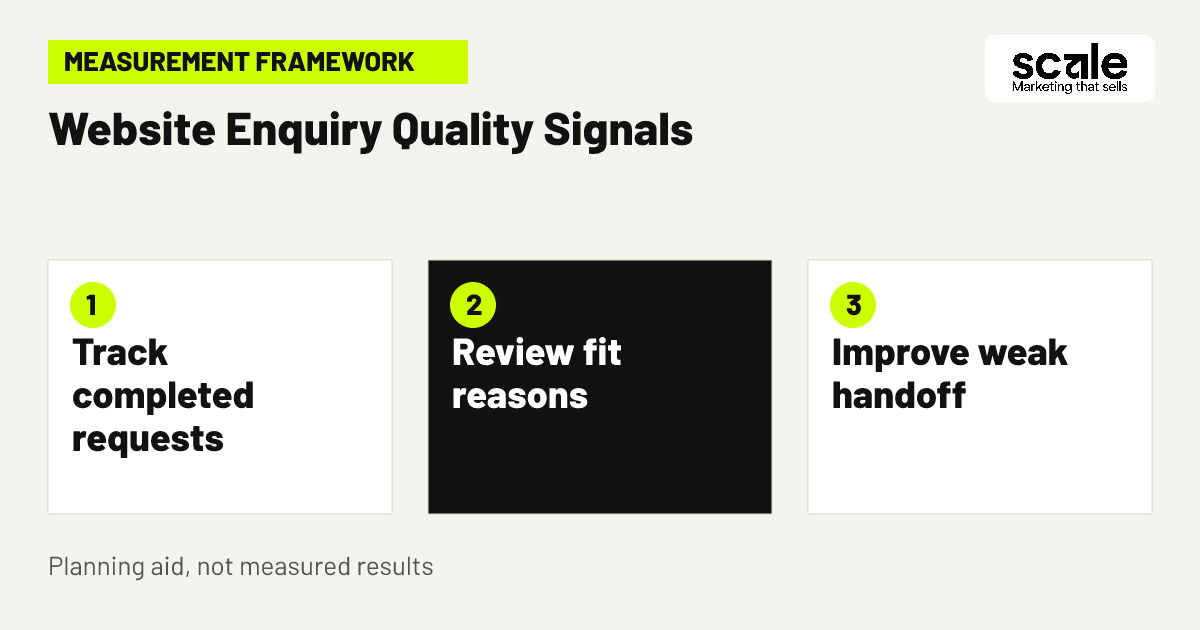
Set up a small measurement plan that follows the real journey: view of a relevant service page, contact action, successful form submission or tracked call action, staff-reviewed fit, and booked restoration assessment where your systems can reliably record it. Define each stage before reporting so different team members do not classify an enquiry differently. Google Analytics events can measure on-site interactions, while the reviewed enquiry record provides the context website analytics cannot know on its own.
Look for signals, not vanity totals. A healthy change may mean more completed requests with sufficient location and service information, fewer preventable mismatches, or a stronger proportion of reviewed enquiries reaching a booked assessment. A rise in page views with flat contact actions can point to unclear calls to action or mismatched traffic. A rise in submissions with poor fit can point to unclear coverage or service explanations.
Take a practical next action for each signal. If form starts are high but submissions are low, test field labels, mobile validation and the amount of required detail. If submission quality is low, improve service-area and service-fit language before adding form friction. If suitable enquiries wait too long for review, reduce promotion temporarily or change routing ownership before expanding campaigns. Outcomes vary, so make changes one at a time where possible and record what changed.
Conclusion: make the assessment request clear before driving more traffic
The best water damage website conversion tips make it easier for a suitable visitor to understand the service, submit the minimum useful details and receive an honest acknowledgement. They also give your team a consistent basis for reviewing location, damage type and capacity. A clearer path is more valuable than a louder promise.
Choose one high-intent service page this week and audit it from a phone: can a visitor identify the service area, understand what an assessment request means, choose a contact route and see what happens after submission? Correct the largest point of uncertainty, test the full handoff, and then use the resulting enquiry-quality notes to guide the next page or campaign change.
Related resources
Water Damage & Mold Restoration Marketing · Google Ads Management · SEO Services · AI Implementations