
How can SEO help SaaS buyers compare fit before a demo?
SaaS SEO ideas work best when they help a potential buyer make a real decision, not when they create more pages around loosely related phrases. This guide is for SaaS founders, growth teams and product marketers who need to attract people comparing software and move suitable visitors towards a trial, a product evaluation or a relevant sales conversation. The direct answer is to publish useful pages for the questions that arise during evaluation, while being precise about who the product serves, what it does and where its limits are.
This approach suits products with a defined audience, documented workflows and someone able to check claims with product or customer-facing teams. It is less suitable when the core offer is still changing, integration information is unknown or every buyer needs a completely bespoke explanation before they can understand the category. In those situations, clarify positioning and product facts first. SEO Services can then turn that source material into a connected set of pages rather than a collection of broad articles.
1. Choose comparison questions where your product has a clear boundary
Start with decisions buyers are already making: whether to replace a manual process, choose between two approaches, add a specialist tool or stay with their current system. A strong comparison page does not need to declare one option universally better. It should explain the jobs each approach suits, the tradeoffs a buyer should consider and the conditions that make your product a sensible candidate.
Create a short page brief before writing. Record the search question, intended reader, current method, problem to solve, product capability to explain, meaningful limitation, supporting evidence available and appropriate next action. If the team cannot fill in those fields accurately, the page is not ready. This prevents a vague competitor page from becoming a sales pitch that gives buyers no useful way to evaluate fit.
Decide when a named alternative belongs on the site
Name a specific alternative only when you can keep the description accurate, current and helpful. Focus on the buyer's workflow, implementation expectations, control needs and selection criteria rather than unsupported feature claims. A category comparison is usually safer and more durable where product details change often or the buyer is deciding between methods rather than brands.
Use a balanced page structure
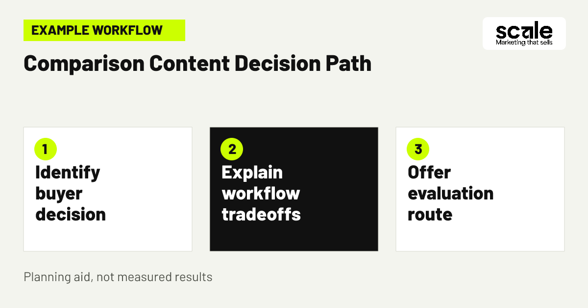
Open with the decision being made, then explain the relevant use cases, evaluation questions, your product's fit and its limits. End with a route to see the relevant workflow, not an aggressive request that assumes the visitor is ready for a demo.
2. Build SaaS comparison pages around an evaluation framework
SaaS comparison pages help buyers evaluate product fit when they reduce uncertainty without hiding the answer behind a form. Use a consistent framework: define the workflow under review, identify the users involved, explain what each option changes, list decision criteria, describe product fit and state the next step. The criteria might include the existing process, team roles, required connections, control level, adoption effort and whether a buyer needs a guided evaluation.
Keep the page specific enough to be useful. A comparison between a spreadsheet process and workflow software, for example, should discuss where a shared sheet remains workable and where ownership, visibility or repeatability become difficult. Link out to the relevant product, integration or use-case page only where it answers the reader's next question. Check that page titles, headings and internal links describe the same decision rather than repeating a keyword in slightly different forms.
3. Turn a recurring sales question into a decision page
Example: a SaaS company sells software that standardises approvals across several teams. Prospects regularly ask whether they can keep approvals in email, manage them in a shared spreadsheet or use a dedicated workflow platform. The company can create a page headed around choosing an approval process, not around claiming that every existing method is inadequate.
The page explains that email can suit occasional, low-risk requests, while a spreadsheet can help a small team track a limited process. It then explains when repeated handoffs, unclear ownership or a need for a visible record may justify dedicated software. The product section shows the relevant workflow and describes any prerequisites, such as which teams must participate. A visitor can then view the workflow, start an evaluation or request a discussion if their situation needs configuration advice. Review sales notes to see whether visitors understand the product's intended use before expanding the topic.
4. Map product-led SEO content to jobs buyers need done
Product-led SEO content earns attention when it teaches a buyer how to assess or improve a real task, while showing where the product can assist. Avoid writing a thin guide merely to insert product mentions. Choose topics from onboarding questions, discovery calls, product documentation gaps and repeated searches that arise before a buyer is ready to choose a tool.
For each topic, decide the reader's desired outcome and the proof needed to support it. A guide about designing an approval workflow might explain roles, handoffs, exceptions and review points. It can then link to a product page that shows how the software supports that workflow. This is useful for self-serve visitors who need to understand the task before trying a product, and for sales-led teams whose prospects need shared language for an internal conversation.
5. Make integration page SEO answer setup and workflow questions
Integration page SEO should start with the joint workflow, not a logo directory. Buyers want to know what data or action moves between systems, who configures it, what access or plan requirements may apply and what the connection does not do. Confirm each statement with the product team before publication, and set a review owner so the page can be checked when either product changes.
Use plain labels that distinguish native connections, supported connectors, exports, imports and workarounds. Those are materially different options. If an integration is planned but unavailable, do not present it as current functionality. A useful page may instead explain the current route and invite a prospective buyer to discuss their requirements. This honesty can reduce enquiries from visitors whose essential workflow cannot be supported.
Use an integration fact sheet before publishing
Ask the product owner for the integration name, user problem solved, trigger or data flow, required access, setup owner, documented constraints, support route and last review date. This source sheet helps marketing avoid overstating capability while giving writers enough detail to make the page useful.
Describe limits in buyer language
Replace vague caveats with practical context. Say whether a buyer needs a particular account type, whether a connection covers only selected records or whether the workflow requires an external setup step. Do not imply automatic synchronisation, real-time updates or broad data coverage unless the product team has verified those details.
6. Publish use-case pages for distinct buying contexts
A generic features page must serve many audiences at once. A use-case page can instead address one recognisable situation, such as approval management for distributed teams or a repeatable process for operations leaders. Choose contexts that differ in problem language, decision makers, required workflow or evidence needed, not merely in job-title wording.
Structure the page around the current problem, intended users, process change, relevant product capabilities, constraints and next step. Include questions a buyer can take into an internal discussion, such as who owns a request, what must be visible and where delays happen today. Do not create a page for every industry or role if the underlying use case is identical. Consolidated pages are easier to maintain and more useful than a large set of near-duplicates.
7. Connect educational pages to the right evaluation route
The call to action should reflect what the reader can reasonably do next. Someone reading a broad process guide may need a checklist or related use-case page. A visitor reading a detailed comparison or integration page may be ready to view the product, begin a trial or discuss technical fit. Do not force every visitor into the same demo request path.
Review the handoff with the people who receive enquiries. If a trial is the best route for independent users, say what they can evaluate there. If a conversation is necessary for a complex workflow, explain what it will cover and what information will help. This aligns content with the SaaS business's route to revenue and avoids counting a casual content download as though it were a qualified opportunity.
8. Strengthen existing pages before creating more topics
Audit current product, solution, help and blog pages for pages that already receive relevant attention or answer part of a comparison question. Look for thin explanations, overlapping titles, broken internal paths, dated screenshots, unverified integration wording and pages that bury important limits. Improving a relevant existing page is often more coherent than publishing another article targeting the same buyer concern.
Assign one primary intent to each page. A feature page should explain the capability. A comparison page should help choose. A resource should teach a task. Where two pages compete for the same intent, merge their strongest material or clarify their different roles. The aim is not to manufacture page volume; it is to make the site's available information easier for a buyer to use.
9. Use internal links to guide a serious evaluation
Internal links should follow the questions that arise naturally during research. A category page can link to a comparison guide; that guide can lead to a use-case page; the use-case page can lead to a product workflow or integration explanation. Use descriptive link text that tells the visitor what they will learn, rather than generic prompts.
Check for dead ends. A buyer reading about a particular integration should be able to find the relevant use case and a product route. A reader on a learning resource should not be sent directly to an unrelated pricing or contact page simply because it is the business's preferred conversion point. Map a few common journeys manually on desktop and mobile, and correct links that make the next decision harder.
10. Include product experts in a practical review loop
Marketing should own clarity and structure, but product, implementation and customer-facing colleagues often hold the details that make a page trustworthy. Set a lightweight review process for claims about workflows, limits, integrations and suitable customer situations. Give reviewers a focused brief with the target question and statements that need confirmation rather than asking them to rewrite the full page.
Maintain a change log that notes what was checked, who confirmed it and when the page should be revisited. This is particularly important for comparison and integration content, where an outdated statement can create the wrong expectation. If reviewers disagree, treat that as a positioning question to resolve before publication rather than smoothing it over with vague language.
11. Refresh comparison content when buyer evidence changes
Set review triggers for pages with fast-changing facts: feature releases, altered integration methods, new packaging, repeated sales objections or a shift in the audience you want to attract. Re-read the page as a prospective buyer would. Can they still understand the choice, verify the stated workflow and see whether they are a fit?
Use feedback from sales calls, trial support and on-site behaviour to identify missing questions. If visitors repeatedly ask whether a connection supports a particular step, add a carefully verified answer or make the limitation clearer. If a page attracts people seeking an adjacent product category, revise the opening and internal context so the intended use is unmistakable. Refreshing should improve the buyer's decision, not merely change a date.
Marketing mistakes that make SaaS content less credible
A common mistake is writing comparison pages as one-sided verdicts. Buyers notice when a page refuses to acknowledge a reasonable alternative or cannot explain when the product is not appropriate. Another is treating an integration name as proof of a complete workflow, even though setup, data coverage or access requirements may matter. Both approaches create mismatched expectations that content alone cannot fix.
Diagnose credibility problems by comparing the page with sales questions, trial feedback and product documentation. Repeated questions about a capability can mean the explanation is unclear. Requests from unsuitable audiences can mean the opening language is too broad. Complaints that the page implied more than the product delivers require a factual correction, not stronger promotional copy. Keep the diagnosis attached to a specific page and buyer question so the remedy is clear.
Measure whether content moves buyers towards a suitable next step
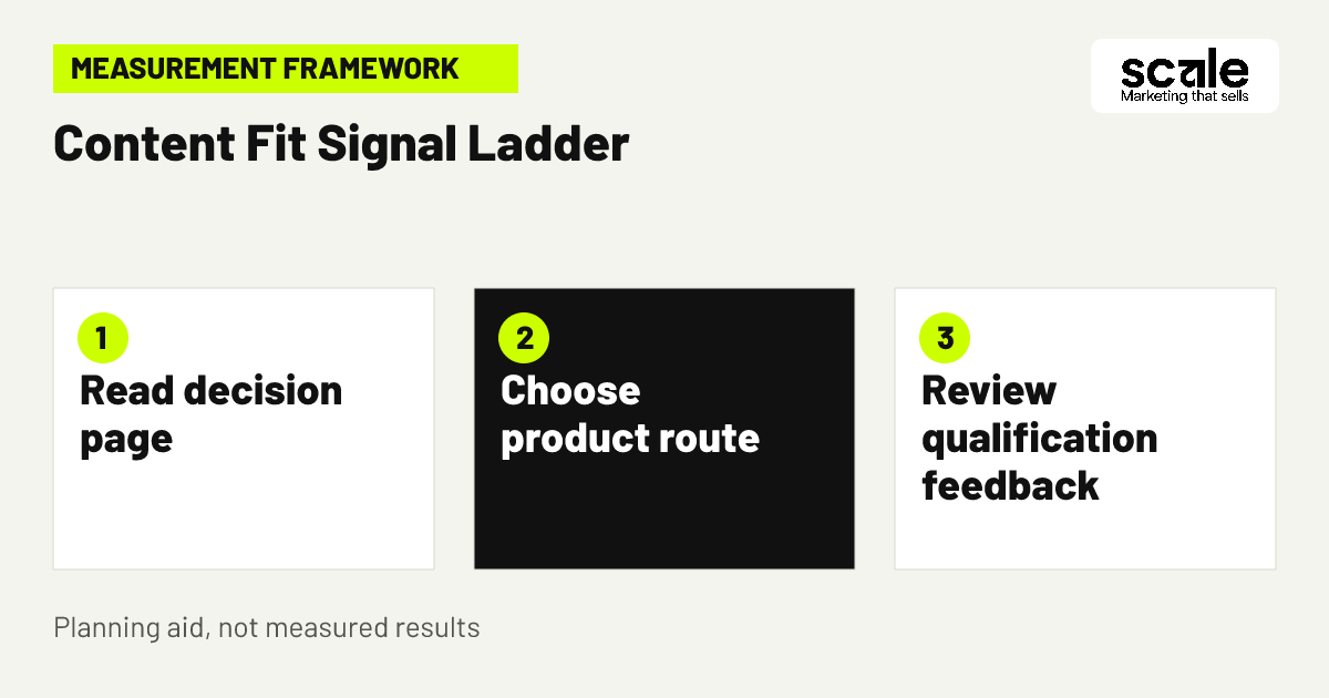
Measure the journey in layers: relevant search visibility and visits, engagement with the decision page, clicks to product or evaluation routes, trial or enquiry actions, and subsequent qualification where the business can connect records responsibly. Analytics events can record interactions such as page views, link clicks, sign-ups and custom actions when correctly set up. Define each event before implementation so it represents a useful decision rather than a random page interaction.
Interpret signals together. Relevant visits with little onward movement may mean the page answers the question but has no clear next step, or it may attract a research audience that is not ready. Strong clicks to an integration page followed by poor-fit conversations may signal unclear limits. A lower volume of enquiries can still be more useful if sales identifies them as better aligned with the intended buyer. Outcomes vary, so use patterns over time rather than a single interaction to decide what to change.
Prioritise the earliest recurring breakdown
If visitors do not reach the right decision page, improve topic coverage and internal links. If they reach it but misunderstand the offer, improve the opening, comparison criteria or limitation statement. If they understand but abandon the next action, review the evaluation path. Only change one major part of the journey at a time where possible, so the team can learn from the result.
Keep reporting definitions consistent
Use the same definitions for a content enquiry, active trial user, accepted sales conversation and opportunity across reporting. A form completion alone is not evidence that the content attracted a suitable buyer. Where records cannot be matched, record that uncertainty instead of treating it as proof of success or failure.
Conclusion: build SEO around the buyer's next decision
The most useful SaaS SEO ideas make comparison easier without pretending that every visitor is a fit. Start with the decisions your team repeatedly explains, turn one into a clear comparison or use-case page, verify every product and integration statement, then connect it to the next sensible evaluation route. Your practical next action is to choose one existing high-intent page and review it against the page brief: buyer question, workflow, evidence, limitation and next step.
Related resources
SaaS Marketing · Paid Search · LinkedIn Advertising · SEO Services · 12 SaaS Google Ads Tips to Improve Demo Quality