
How should a storefront guide shoppers to relevant products?
Amazon storefront marketing ideas are most useful for sellers with related products who want shoppers to understand the range before choosing an item. Amazon describes Brand Stores as multi-page brand destinations that feature a product portfolio. Use that format as a reason to make browsing easier, not as a reason to display every available product at once.
Start by checking that featured product detail pages accurately describe titles, images, variations, pack contents and availability. A storefront can frame a buying decision, but it cannot correct an unclear listing or unavailable offer. If shoppers usually arrive with a highly specific search and buy a single item, listing optimization may deserve attention before a broader browsing route.
1. Choose the shopper mission before planning pages
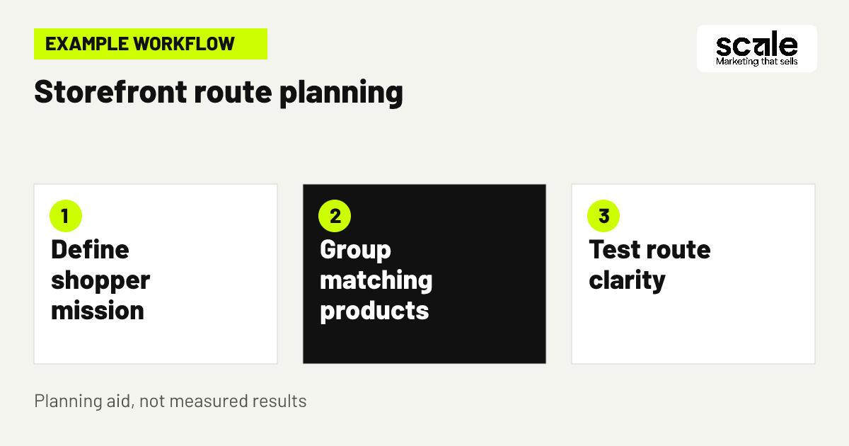
Begin with the decision a visitor is trying to make. They may be selecting a first product, replacing a consumable item, comparing sizes, finding a gift or building a set for a defined use. Choose a small number of missions that reflect genuine differences in how people shop rather than internal product codes or launch dates.
Write a brief for each proposed destination: the intended visitor, the question they need answered, the products that belong there, the product facts needed for comparison and the next useful click. For example, a home-organization brand could separate shoppers seeking a complete starting set from returning buyers looking for add-on containers.
Keep a route only when it helps a visitor narrow a real choice. Combine pages that lead to the same products with nearly identical meanings. Scale's marketplace support can help connect this planning to listing information, so the browsing message and product information remain consistent.
2. Build an Amazon brand storefront around clear entry routes
An amazon brand storefront should offer an obvious starting point without assuming visitors already know the catalogue. Identify practical ways people shop the range, such as use, product type, compatibility, bundle size or recipient. Give each route a clear label and a distinct destination.
Test the proposed route before publishing. Ask someone unfamiliar with the products to locate an item for one purpose, then find an alternative at another size or price point. Their pauses and backtracking can reveal vague labels, a missing comparison route or a collection that mixes different needs.
Keep the visual hierarchy focused on one decision at a time. Competing banners can make a page appear busy without telling shoppers where to go. Store features and publishing controls can differ by account and marketplace, so confirm what is available in your account before relying on a particular layout or media treatment.
Use labels that describe a buying decision
Navigation labels should explain what shoppers will find and why it is useful. Labels such as "Choose by room," "Replacement parts," "Starter sets" or "Travel sizes" are often clearer than internal range names. The aim is to reduce uncertainty before the next click.
Check labels against the destination
Open every destination and confirm that its products and supporting information match the expectation created by the label. If a starter-set page contains unrelated individual items, rename the route or move those items. Clear wording supports better comparisons.
3. Create collections that support a real comparison
An amazon product collection should help shoppers compare a limited set of alternatives for the same need. Useful organising principles include capacity, room of use, starter versus refill status, compatible product family or a defined routine. Avoid catch-all groups created simply to show more products.
For example, a reusable food-storage brand could direct visitors to lunch packing, pantry storage, starter sets and replacement lids. The lunch-packing route can focus on portable formats and explain the practical difference between compact and family-size choices. The replacement-lids route can remind shoppers to check the relevant container range on the product detail page.
Evaluate each group by asking whether every displayed item shares one understandable selection criterion. If shoppers must read every title to understand why an item appears, reduce the group, improve its name or add a brief factual explanation. Do not make collection claims that the product detail page cannot support.
4. Make Amazon brand navigation predictable on every page
Amazon brand navigation works best when visitors retain their orientation while moving from a broad category to a narrower choice. Use the same terms across relevant pages and make page headings specific enough to show where the visitor is in the range. A shopper entering on a category route should still be able to reach adjacent choices without starting over.
Map the intended journey before editing. List the home page, the main collection pages and the related routes beneath them. Then identify dead ends. A collection should normally offer a useful onward choice, such as a related product group or a return route to the main category.
Review routes on a small screen as well as a desktop browser. Long labels, crowded links and similar category names can be harder to interpret on mobile. Simplify the structure when a label needs a sentence of explanation.
5. Separate first-purchase routes from repeat-purchase routes
First-time shoppers often need orientation, while returning shoppers may want a familiar format, refill or accessory quickly. Giving both audiences the same route can add unnecessary decisions. Create one route that introduces the range and another that helps repeat buyers identify compatible or replenishment products.
This approach is especially useful for systems, sets and recurring formats. A starter route can explain what a buyer receives and which option suits a common use. A refill or accessory route should focus on compatibility, quantity and the product facts a shopper should verify before selecting an item.
Evaluate the split through recurring buyer questions, listing feedback and the clarity of product detail pages. If people regularly ask what to buy first, improve the introductory route. If they struggle to locate a replacement, improve the repeat-purchase route and ensure relevant listings state factual compatibility limits.
6. Use category page design to show choice criteria
Amazon category page design should make the main comparison criterion visible before a shopper opens individual listings. Decide what separates the choices, such as dimensions, intended user, material, item count, compatibility or use setting. Then make sure the products shown consistently reflect that distinction.
For a personal-care tool range, a category route might separate daily care, travel options and replacement heads by routine step. This gives visitors a practical way to begin comparing products instead of asking them to infer every difference from images and model names.
Use a simple review question: can a visitor explain why they would choose one displayed group over another without opening every product? If not, strengthen the category framing, adjust the assortment or improve accurate comparison information. Listing optimization remains important because the product detail page must confirm the expectation set by the route.
7. Put complementary products in useful context
Complementary products can help shoppers discover a fuller solution when their relationship is clear. Pair an accessory with the relevant core product, show a refill near the compatible system or connect a bundle to the individual products it contains. Avoid adding loosely related products to every collection simply because they share a brand.
Introduce the group with a short factual explanation of who it suits, what it works with and what the shopper should verify. For example, a storage-system route can place dividers and labels after core containers while directing visitors to check dimensions and included components on each detail page.
Assess the connection by asking whether a shopper can describe it in practical terms. If the relationship depends only on a broad lifestyle theme, it may distract from the main choice. Keep the primary product decision visible and position related products as a secondary option.
8. Align storefront messages with product detail pages
Every storefront route should lead to a product detail page that confirms its central message. Before featuring a product, compare the collection wording with the listing title, main image, selected variation, contents and stated limitations. A shopper should not reach a different size, pack configuration or compatibility description after clicking through.
Create an alignment checklist for each featured item: its collection, the shopper need expressed on that page, the product fact that supports the fit, the variation to check and the listing element that confirms it. If the listing does not support the route's message, revise the route or remove the product.
Sponsored Products are a separate route into product detail pages. Amazon states that these ads promote individual listings and direct ad clicks to the advertised product detail page. When using PPC management, align the product selected for advertising, the targeting theme and the landing listing around the same shopper decision.
9. Plan seasonal pages only when the offer stays clear
Seasonal organisation can provide a timely entry point when it clarifies a genuine use occasion. A gifting, travel or back-to-routine route can be useful when the products truly fit that need and their product information remains accurate. Adding seasonal language alone does not create a helpful shopping path.
Before using a seasonal collection in promotion, check current availability and the factual common ground between selected products. Remove any item that needs exaggerated wording to fit the theme. Products that are useful year-round but not meaningfully relevant to the occasion should stay in their core category.
After the occasion, decide whether the page can become an evergreen use-based route. If it cannot, remove or update it promptly. Outdated event language can confuse shoppers comparing current products and weaken confidence in the range.
10. Give each page one job and one next click
A useful storefront page does not need to show the full catalogue. Decide whether a page should introduce the range, narrow a category, compare a group or direct visitors toward a defined type of product. Then select the next click that best completes that job.
Remove repeated product displays that do not add a new decision. Seeing the same group on a home page, category page and subcategory page without new context creates friction. Use each stage to reveal a relevant distinction, such as format, compatible system or intended environment.
Review one route from entry to product detail page and count decisions rather than clicks. A short route with unclear choices remains weak, while a slightly longer route can work when each step answers a question. Marketplace support can help maintain page structure as the range changes.
Marketing mistakes that make storefront browsing harder
A common mistake is treating the storefront as a brand brochure instead of a shopping aid. Warning signs include large visual areas without a clear product route, category names understood only by insiders and grids that combine unrelated products. Test this by asking a new visitor to find an item for a defined need and explain why they selected that route.
Another mistake is using the storefront to compensate for incomplete product information. If a route repeatedly has to explain dimensions, contents or compatibility, improve those facts on the relevant product detail page as well. Amazon's advertising guidance also emphasizes strong product information and in-stock advertised products.
Avoid changing navigation, collection copy, assortment and paid targeting at the same time. That makes it difficult to learn why shopper behaviour changed. Record one meaningful change, its reason and the signal you plan to review before making the next major adjustment.
Measure whether storefront visitors reach suitable product pages
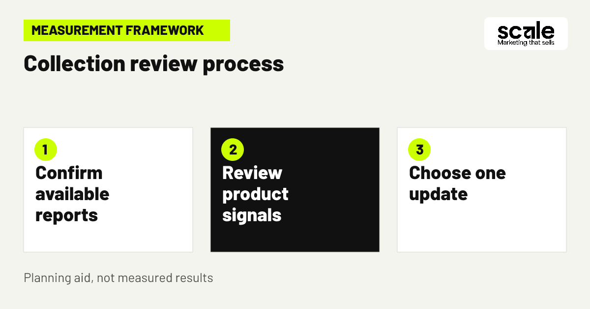
Start by confirming which storefront and product reporting is available in your account and marketplace. Do not assume that every page-level or collection-level metric is available. Where accessible, use the available store signals alongside product-page activity, stock status, offer changes and recurring customer questions to assess whether a route is helping shoppers reach relevant listings.
Interpret signals in context. A collection that receives attention but does not appear to move visitors toward featured products may need a clearer label, a narrower selection or fewer competing choices. If shoppers reach listings but frequently ask about fit, contents or variations, improve those listing elements before rebuilding the storefront. Outcomes vary, so avoid decisions based on one short period.
When Sponsored Products supports a product range, Amazon provides campaign reporting on advertised products, targets and placements. Compare that reporting with the intended shopper need and the advertised listing. A mismatch is a reason to review targeting, product selection or listing clarity, then make one focused change.
Turn signals into a practical next action
If visitors seem to reach a collection without selecting suitable products, simplify the group or state the comparison criterion more clearly. If product questions repeatedly concern fit or contents, improve the relevant listing image, bullet point or specification. If ad reporting indicates poorly matched targeting, refine the campaign before redesigning the store route.
Keep a change record
Log the date, page changed, products affected, old and new wording, reason for the update and the available signals to review. Note stock interruptions, offer changes and major listing edits too. This record helps separate merchandising changes from factors that can influence customer behaviour.
Conclusion: start with one shopper route worth simplifying
The most effective amazon storefront marketing ideas make a product range easier to shop rather than simply more visible. Choose clear shopper missions, create focused collections, use predictable navigation and ensure each route leads to a listing that confirms the promise. Use paid promotion when the advertised product and its detail page match the likely shopper need.
Choose one existing route today and write down the visitor's question, the products that genuinely answer it and the next click they should take. Remove one unrelated product or replace one vague label. Then document the update, verify the reporting available to you and review the result before making another major change.
Related resources
Amazon Marketing · 12 Amazon Listing Optimization Tips to Improve Conversions · 11 Amazon PPC Campaign Tips to Attract Product Shoppers