
How can a product page help a shopper decide?
The most useful ecommerce product page tips help a shopper answer four questions without leaving the page: What is this, is it right for me, what will it cost and involve to receive, and what happens when I choose it? This guide is for store owners whose product pages get visits but do not consistently move suitable shoppers toward a cart and checkout. The direct answer is not to add more persuasive copy everywhere. It is to remove uncertainty in the order a buyer encounters it, while preserving a simple buying path.
Before changing a template, confirm that the product is available, the price and variant data are accurate, mobile pages load reliably, and the team can edit content and inspect analytics. A page refresh is less suitable when the core issue is unavailable stock, unclear fulfilment rules, or a checkout fault; solve those operational blockers first. Storefront optimization can then focus on the page decisions that marketing traffic actually encounters.
1. Choose the one decision each page must support
Start with a single purchase decision, not a list of brand claims. For a simple item, the decision may be choosing a size and adding it to the cart. For a considered item, it may be confirming compatibility, material, dimensions, or intended use. Put the product name, a plain-language benefit, current price, key option selection, and purchase control in the first screen area, especially on mobile.
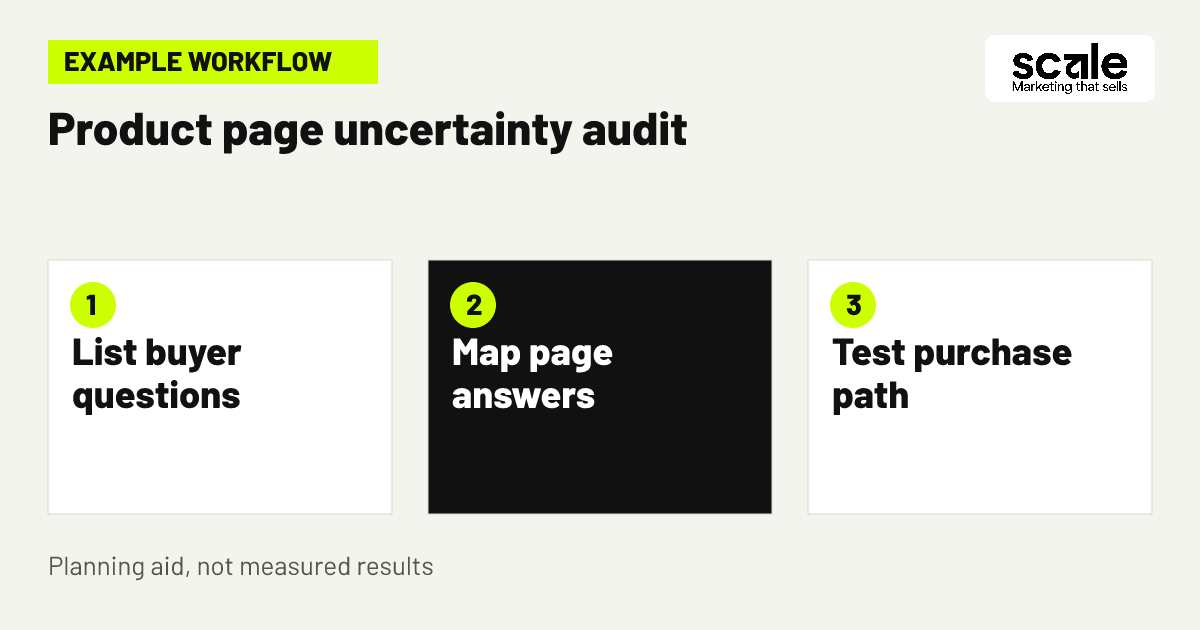
Create a short page brief before design work: name the intended shopper, the main use, the most likely hesitation, the proof needed to resolve it, and the next action. A reusable water bottle page, for example, may need capacity, lid type, cleaning guidance, and an image showing scale. This brief prevents a page from copying generic competitor language while missing the information a buyer needs.
2. Put essential buying information beside the purchase control
Keep the information that changes a purchase decision close to the option picker and button. This normally includes price, selected variant, availability status, delivery expectations where appropriate, and return or exchange guidance that is accurate for that item. Do not make shoppers hunt through a footer or abandon the page to find a basic policy. The goal is informed action, not pressure.
Review the mobile layout manually. Check whether a sticky purchase control hides variant choices, whether an error message explains an unavailable combination, and whether the selected option remains visible after a shopper scrolls. These add to cart improvements matter because an unselected size, unclear out-of-stock state, or button that appears inactive can look like a technical failure rather than a decision the shopper must make.
Make option selection understandable
Use option labels that describe the choice a customer is making, such as Size, Finish, or Subscription frequency. Show the selected value in plain text and update product-specific details only after verifying that the catalogue data supports the change.
Check every option combination
Test common and edge combinations on a phone and desktop: available options, unavailable options, a return to a previous choice, and a direct visit from a campaign link. Record confusing states as template defects rather than leaving each product owner to patch them separately.
3. Build images around the questions shoppers ask
Ecommerce product photography should show more than an attractive hero image. Plan a sequence that answers a visual question at each step: overall appearance, scale, key material or texture, how the item is used, what is included, and relevant variant differences. Use consistent framing so a buyer can compare products without mentally recalibrating every image.
Example: A store selling a desk lamp finds that its main page has a polished front view but does not show the power cable, shade scale, or switch placement. Its revised image brief includes the lamp on a desk, a close view of the switch, a side angle showing the cable route, and a labelled image of what arrives in the box. The team then checks whether visitors interact with the gallery and whether more shoppers progress from the page to a cart; it does not assume images alone solve pricing or delivery objections.
4. Write a description for scanning before detail
Product description optimization begins with structure, not decorative wording. Open with one or two sentences explaining who the product suits and its practical value. Follow with scannable details such as dimensions, materials, fit, care, compatibility, and included items. Reserve technical specifications for shoppers who need them, but do not bury an essential limitation in a long paragraph.
Match the language to the actual decision. A skincare accessory needs usage and care directions; a replacement part needs exact compatibility; a giftable item needs what the recipient receives. Avoid unsupported superlatives and vague phrases such as premium quality when a tangible description would be more useful. Have someone unfamiliar with the product read the page and identify any question they would still need answered before buying.
5. Show size, fit, and compatibility before doubt grows
Fit uncertainty is a major reason shoppers pause on apparel, furniture, accessories, and technical products. Give dimensions in a consistent format, explain how to measure where useful, and place a concise fit or compatibility cue near the selector. A size guide should resolve a choice, not send shoppers into a dense table that lacks product-specific context.
For a phone accessory, state the compatible model names exactly and show where the model can be checked. For apparel, explain the garment cut and include model or product dimensions only when the store can maintain them accurately. Audit support messages and product returns for repeated wording; that language often reveals the missing clarification. If the issue relates to a single item, improve its content. If it affects many items, update the product template and merchandising data.
6. Make delivery and returns easy to find
Delivery timing, shipping eligibility, and return conditions can affect the buying decision as much as the product itself. Provide a short, accurate summary near the purchase area and link to fuller policy information where it genuinely helps. Do not state a delivery promise that depends on a location, cutoff, carrier, or stock condition unless the store can show the applicable condition clearly.
For products with special handling, explain the relevant constraint before checkout. A made-to-order item may need a production note; a fragile item may need a handling explanation; a subscription item may need a renewal and cancellation summary. Keep this information practical and neutral. The objective is to reduce surprise, which supports more suitable orders and clearer customer expectations.
7. Use reviews and proof where they answer objections
Social proof works best when it provides a decision-relevant detail rather than a wall of praise. Place verified review content, customer questions, material information, or product demonstrations near the concern they address. A review about fit belongs near sizing; feedback about durability is useful beside materials and care. Never edit comments into claims the reviewer did not make or present unverified statements as customer feedback.
If a catalogue is new or has limited reviews, do not create artificial proof. Strengthen the page with accurate specifications, clear images, and a straightforward returns explanation instead. Review themes can guide page improvements: repeated questions about colour, assembly, or included items point to missing content. Separate a genuine product objection from a page comprehension problem before changing the product offer.
8. Keep the call to action specific and reliable
The primary button should make the next action unambiguous, such as Add to cart, after required choices are made. Avoid placing equally prominent actions beside it unless they serve a distinct need, such as saving an item for later. Where an option must be selected, tell the shopper what is missing and move attention to that control rather than showing a generic failure message.
Check the complete interaction path, not just the button label. Test the page with a variant selected, without a variant selected, with an unavailable option, and after changing quantity. Confirm that the cart reflects the right product and choice. These checks expose add to cart improvements that copywriting alone cannot address, including mismatched variant data and controls that become hard to reach on smaller screens.
9. Match campaign promises to the landing product
When paid advertising or email links send visitors to a product page, the page must immediately confirm the message that brought them there. Match the product name, variant, offer condition where applicable, and visual focus to the campaign. A broad collection page may be appropriate when a shopper needs to compare, but a specific ad about one item should not lead to an unrelated category.
Google Ads can bring people to a store while they are searching for relevant products, so landing-page relevance deserves the same planning as the ad message. Check mobile rendering, destination links, and page availability before launching or changing campaigns. If a campaign draws visits but shoppers leave quickly, compare the campaign promise with the opening page content before assuming the product itself is the problem.
10. Reduce mobile friction without hiding useful detail
A mobile product page needs a clear route through images, purchase choices, and supporting details without forcing constant scrolling back and forth. Use expandable sections for longer care or specification content, but keep the information needed to select and buy visible or one obvious tap away. Make tap targets forgiving and avoid overlays that cover the purchase control.
Test with ordinary shopper behaviour: open the gallery, choose an option, read delivery information, add the item, and view the cart. Do this on more than one screen size if possible. Note where a user must remember a detail because it disappears after a choice. A concise sticky bar can help when it retains the selected variant and price, but it should not conceal warnings or replace a clear main purchase area.
Decide what can be collapsed
Collapse supporting education, lengthy specifications, and secondary FAQs when the headings are descriptive. Keep the product identity, price, required choices, and primary action easy to locate at all times.
Protect the buying path
Before publishing, check that chat widgets, consent prompts, discount pop-ups, and accessibility controls do not overlap gallery controls, option selectors, or the cart action. Treat any overlap as a conversion-path defect, not merely a visual issue.
11. Use product page questions to improve the catalogue
Product pages should be consistent enough that shoppers learn where to find key information across the store. Create content fields for the recurring facts that matter in the category: dimensions, materials, compatibility, care, included items, delivery note, and warranty wording if applicable. This lets the team populate a dependable template rather than reformatting every listing by hand.
Prioritize products that attract paid traffic, have frequent customer questions, represent important inventory, or have unusually weak shopper progression. Do not roll out a new layout to every product without checking how each category uses options and specifications. A fashion template, for example, may need a size guide close to selection, while an electronics accessory needs compatibility as the dominant field.
12. Change one meaningful friction point at a time
A controlled sequence makes product-page work easier to learn from. Begin with an audit, select one high-impact uncertainty, make a clear change, verify it works, and observe the relevant behaviour before adding the next major adjustment. Bundling a new image gallery, rewritten description, shipping policy, layout, and promotion at once may create movement, but it leaves the team unable to explain what helped or harmed the buying path.
Keep a change log with the page or template affected, the shopper question being addressed, the exact change, release date, quality checks, and the measures to review. Conversion optimization is a cycle of evidence and judgement, not a one-time redesign. Outcomes vary with product demand, price, traffic quality, stock, and checkout experience, so use the log to make the next decision more accountable.
Marketing mistakes that make product pages harder to use
A common mistake is treating every visitor as if they need the same information. New shoppers may need a use explanation, returning shoppers may need variant availability, and comparison shoppers may need specifications. Diagnose this by reading page recordings or support themes where consent and privacy practices allow, reviewing search terms within the store, and asking which question appears before a shopper leaves or contacts support. Then place a concise answer at that point rather than duplicating it throughout the page.
Another mistake is copying a competitor’s layout without checking catalogue requirements. A large gallery may be useful for colour-driven products yet distract from compatibility details on a replacement part. Also avoid overloading the page with badges, pop-ups, countdown messages, or competing buttons. If the page feels busy, remove elements that do not answer a shopper question or advance the purchase decision. Test the page after each removal, because a visually quieter layout is only useful if essential information remains discoverable.
Do not diagnose a product page solely from total sales. Traffic may have changed, inventory may be limited, or a checkout issue may be responsible. Compare the page’s interaction signals with stock status, campaign destinations, cart behaviour, and customer feedback. This gives a more credible explanation than declaring a design change successful or unsuccessful from a single broad number.
What should you measure after updating a product page?
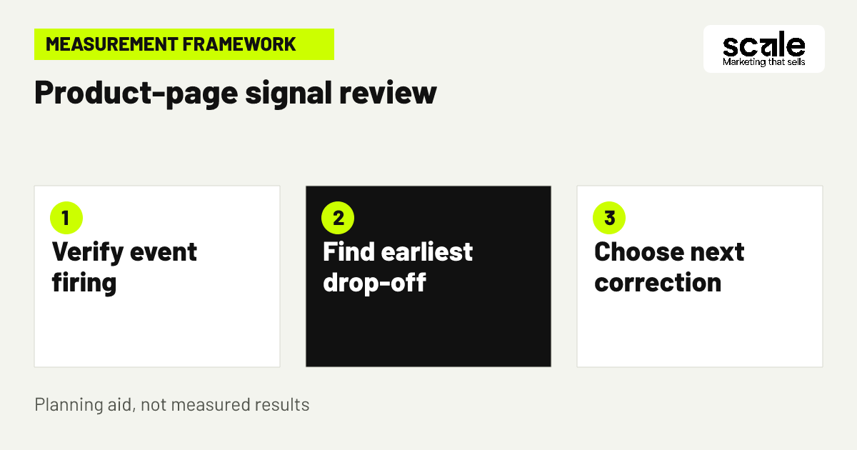
Measure the path, not only the final order. Track product views, option selections where technically appropriate, image or size-guide engagement, add-to-cart events, cart views, checkout starts, purchases, and product-specific error states. The product page conversion rate can be assessed alongside these steps, but it needs context from traffic source, device type, product availability, and checkout health. Define each event and its parameters before comparing periods so the data describes the same behaviour.
Google Analytics events can record user interactions such as page loads, link clicks, and purchases. For ecommerce pages, confirm that the implementation can identify the relevant action and product context, then use debugging tools before relying on reports. A sudden drop in add-to-cart events may mean shoppers changed behaviour, but it may also mean a selector, button, or tracking event stopped working. Validate the on-page action first.
Interpret signals as prompts for investigation. Many product views with limited gallery engagement can suggest the opening image already answers the visual question, or that the gallery is not easy to use. Strong option activity with weak cart additions may point to unavailable combinations, unclear price changes, or missing delivery detail. Cart additions with weak purchase completion shift attention beyond the product page toward cart, checkout, payment, or fulfilment expectations. Choose one practical follow-up based on the earliest reliable drop-off.
Conclusion: turn one shopper question into a page improvement
The best ecommerce product page tips make a buying decision simpler through accurate product information, purposeful imagery, reliable controls, and measurement that follows the shopper’s path. Start with one priority product template and identify the single question most likely to block a suitable buyer. Audit its mobile purchase flow, correct that question with content or interface changes, verify tracking and page behaviour, then use the resulting signals to decide what to improve next.